
Quick Answer: The McKinsey "look" is not a template — it is a method. To make consulting-style slides: (1) lead with the answer (the Pyramid Principle / SCQA), (2) write action titles that form a storyline when you read them top to bottom, (3) put one idea per slide, (4) end every exhibit with a "so what" takeaway, (5) storyboard a ghost deck before you design anything, and (6) keep the design restrained — limited color, one clean sans-serif, source lines, lots of white space. The fastest way to get there is to nail the logic first: tools like ChatSlide generate an outline-first deck with real charts from your data, so you spend your time sharpening titles and arguments instead of fighting layout.
The McKinsey Look Is a Method, Not a Template
People search for a "McKinsey template" expecting a magic .pptx that makes their slides look elite. It does not exist — and chasing it misses the point. As a former Presentation Design Lead explained in a much-discussed r/powerpoint thread (221 comments and counting), what makes a top-tier consulting deck is not the colors or the fonts. It is the thinking — a rigid logical structure that the visual design simply serves.
In the same thread, the OP nailed what bad decks look like: "three boxes, random icons, bullet points that don't mean anything." That is the opposite of consulting craft. Consultants build slides that argue a case. Every slide has a point, every point ladders up to a recommendation, and the design exists to make that argument unmissable.
This guide walks through the actual method — the same principles taught at the top firms — and how to apply them whether you build by hand or with AI.
1. Lead With the Answer (The Pyramid Principle)
Barbara Minto's Pyramid Principle is the backbone of consulting communication. The rule: state your conclusion first, then support it. Do not build up to a recommendation over 20 slides — open with it, then spend the rest of the deck proving it.
A clean way to frame the opening is SCQA:
- Situation — the stable context everyone agrees on
- Complication — what changed or what is at risk
- Question — the question that naturally raises
- Answer — your recommendation, stated plainly
Your executive summary slide is the answer. Everything after it is evidence, organized so a busy reader can stop at any point and still have the gist.
2. Write Action Titles, Not Topic Labels
This is the single biggest difference between a consulting deck and a corporate one. A normal slide title is a label: "Q3 Revenue." A consulting title is a sentence that states the takeaway: "Q3 revenue grew 18%, driven entirely by enterprise renewals."
The title carries the message. The exhibit below it is proof. If someone reads only your titles, they should get your entire argument.
The storyline test: copy every slide title into a single document, in order, and read them top to bottom. They should flow like a paragraph that makes your whole case. If they read like a table of contents ("Overview," "Background," "Analysis," "Recommendation"), you have labels, not a storyline — rewrite them.
3. One Idea Per Slide
Each slide makes exactly one point. If you have two ideas, you have two slides. This feels wasteful to people used to cramming, but it is what makes consulting decks scannable and persuasive. A slide that argues one thing, clearly, beats a slide that gestures at five.
Practically: if your action title needs an "and" or a semicolon to hold two claims, split the slide.
4. Put a "So What" on Every Exhibit
Consultants are trained to ask "so what?" of every chart. A bar chart on its own is data. A bar chart with a takeaway title and a callout that says "this gap is the entire margin problem" is an argument.
For every exhibit:
- Give it a takeaway title (the conclusion, not "Sales by Region").
- Highlight the one data point that matters — color, a circle, an arrow — and grey down the rest.
- Add a short annotation that states the implication.
- Include a source line at the bottom ("Source: Company financials, 2025"). Sourced exhibits signal rigor.
5. Storyboard a Ghost Deck First
Before opening any design tool, consultants build a "ghost deck" — the entire presentation as nothing but action titles, one per slide, sometimes with a rough sketch of the exhibit. This is where the thinking happens.
- Write the recommendation (your answer).
- List the 3–5 arguments that support it (these become sections).
- Under each, write the slide-level action titles that prove it.
- Read the titles end to end. Fix the logic now, while it costs nothing.
- Only then design the slides.
Designing before storyboarding is why most decks sprawl. Lock the argument first.
6. Structure Your Buckets MECE
MECE — Mutually Exclusive, Collectively Exhaustive — means your groupings do not overlap and together cover the whole problem. If your three drivers of cost are "labor, materials, and overtime," that is not MECE (overtime is labor). Clean buckets make your logic feel airtight and your slides easy to follow.
Apply MECE to your sections, to the columns in a framework, and to the items in any list.
7. Keep the Design Restrained
The visual style is deliberately understated so nothing competes with the argument:
- One sans-serif font. Arial is the consulting cliché for a reason; Helvetica, Inter, or Source Sans work too. One font, two or three sizes.
- A tight color palette. One dark neutral for text, one accent for emphasis, grey for everything de-emphasized. That is it. Color is a tool to direct attention, not decoration.
- No clip art, no random icons. Icons appear only when they carry meaning, never as filler.
- Generous white space. Dense is fine; cluttered is not. Align everything to a grid.
- Consistent everything. Same title position, same margins, same chart style on every slide.
The look is "serious and clear," not "designed." If a slide looks decorated, you have gone wrong.
8. The Horizontal and Vertical Logic Check
Before you call a deck done, run two checks consultants use:
- Horizontal logic: Do the titles, read in sequence, tell a complete and convincing story? (The storyline test from step 2.)
- Vertical logic: On each individual slide, does the exhibit actually prove the claim in the title? No title should promise more than the chart delivers.
If both pass, you have a consulting-grade deck.
Consulting Deck vs. Typical Corporate Deck
| Element | Typical corporate slide | Consulting-style slide |
|---|---|---|
Title | Topic label ("Revenue") | Action title (the takeaway, in a sentence) |
Ideas per slide | Several | Exactly one |
Charts | Decoration, no point | Argument, with a "so what" and source |
Structure | Loose, builds to a point | Answer-first, MECE buckets |
Design | Template colors, icons, clip art | Restrained, one font, one accent, grid |
Test of quality | "Looks nice" | Titles read as a story; exhibits prove titles |
The Fast Path: Get the Logic Right, Then Polish
The hard part of a consulting deck is the structure — and that is exactly what most slide tools ignore, dumping you straight into formatting. A better workflow is to generate a logically structured first draft, then spend your effort sharpening the argument.
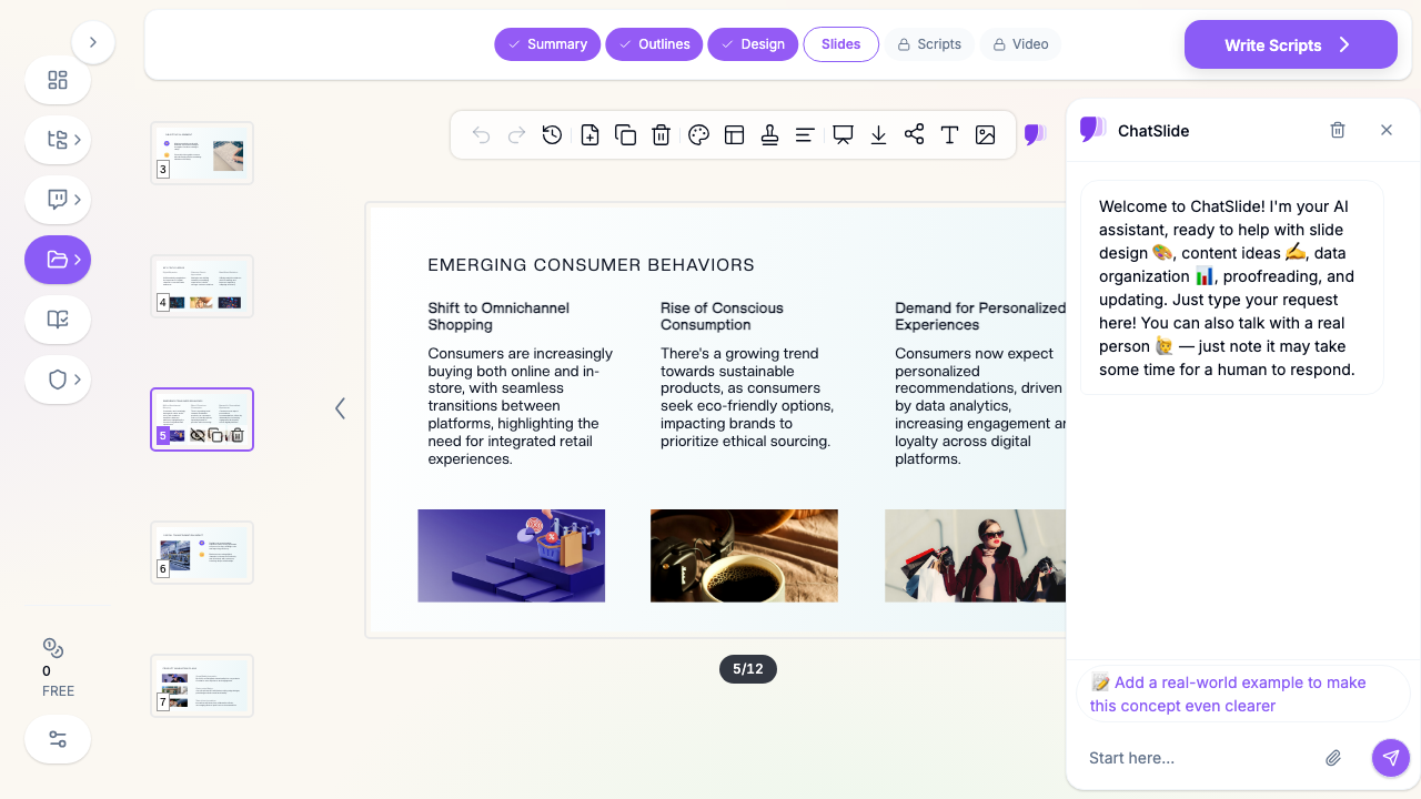
ChatSlide AI is built outline-first, which maps cleanly onto the consulting method. You give it your source material — a report, a data set, your raw analysis — and it produces an editable outline you can shape into a storyline before a single slide is designed. It pulls real charts from your actual numbers (not stock chart images), drafts slides with proper titles and speaker notes, and lets you rewrite any title into an action title with a targeted edit. You keep full control of the thinking; the tool removes the hours of manual layout. Export to PowerPoint when you want to add the final consulting polish by hand.
It will not do the strategic reasoning for you — nothing can. But it gets you to a structured, chart-backed draft fast, so the time you have goes into the part that actually makes a deck McKinsey-grade: the argument.
Frequently Asked Questions
Is there an official McKinsey PowerPoint template? No public one, and it would not help much if there were. The firm's decks look the way they do because of the method in this guide, not a downloadable theme.
What font does McKinsey use? Decks are typically built in a single clean sans-serif — Arial is the long-running default. The specific font matters far less than using one consistently.
How many bullet points should a consulting slide have? As few as possible. Many consulting slides have none — the message is the action title and the exhibit. When you do use text, keep it to short, parallel, MECE points.
How is this different from a normal business presentation? A normal deck presents information. A consulting deck argues a recommendation, answer-first, with every slide laddering up to it. Same tools, completely different discipline.
Summary
McKinsey-style slides come from a method, not a template. Lead with your answer, write action titles that read as a storyline, keep one idea per slide, and make every exhibit prove its title with a clear "so what." Storyboard a ghost deck before you design, structure your thinking MECE, and keep the visuals restrained so nothing distracts from the argument. Build the logic first and the design becomes easy — and an outline-first tool like ChatSlide gets you to a structured, chart-backed draft fast, leaving your time for the thinking that actually sets a consulting deck apart.