Quick Answer: AI slides look AI-generated because of a recognizable "fingerprint": three-box layouts, meaningless icons, generic stock images, hollow bullet points, and identical structure on every slide. To fix it: (1) feed the AI your own sources and data, not just a topic, (2) turn real numbers into real charts, (3) replace generic icons and stock images with specific, relevant visuals, (4) rewrite the text to cut filler and add real specifics, (5) vary the layouts, (6) apply your brand fonts and colors, (7) add a human point of view via action titles, (8) cut the slide count, and (9) edit — never ship the first draft. The biggest lever is the tool: pick one like ChatSlide that builds from your content with real charts and full editing control, so the output starts specific instead of generic.
The "AI Fingerprint" Is Real
Audiences can now spot an AI deck from across the room, and they hold it against you. The complaint is everywhere on r/powerpoint. In one much-discussed thread, a former McKinsey design lead described the generic AI deck perfectly: "three boxes, random icons, bullet points that don't mean anything." A separate "hot take" thread on AI slide generators (51 comments) piled on, and a thread dissecting a 25-slide deck built with Claude coined it the "signature look" — that instantly recognizable sameness.
Here is the key insight: the problem is almost never that you used AI. It is that you shipped the AI's first draft, generated from a one-line prompt, with no specifics added. Generic input produces generic output. Below are the tells, and the nine fixes that make AI slides look like a human who knows the subject made them.
The common tells
- Three evenly-sized boxes on slide after slide
- Icons that decorate but mean nothing
- Interchangeable stock imagery (the same abstract gradients and handshakes)
- Bullet points full of filler — "leverage synergies," "drive impact"
- The exact same layout and rhythm on every slide
- No real numbers, no real examples, no point of view
- Too many slides, each saying very little
1. Feed It Your Content, Not Just a Topic
The number-one cause of generic slides is a generic prompt. "Make a deck about customer retention" gives the AI nothing but its training-data average — so you get the average-looking deck.
Instead, give it your material: the actual report, your notes, the meeting transcript, the spreadsheet, the research paper. When the AI works from real source content, the slides fill with real specifics instead of platitudes. This single change does more than every design tweak combined.
2. Turn Real Numbers Into Real Charts
"Three boxes with made-up percentages" is the most obvious AI tell. Replace it with charts built from your actual data. A real bar chart from your real numbers cannot look generic — it shows your reality, which no template can fake.
Use a tool that generates editable charts from data you provide, not stock chart images. If your AI deck has decorative boxes where data should be, that is the first thing to fix.
3. Replace Generic Icons and Stock Images
Random icons and interchangeable stock photos scream AI. Two fixes:
- Cut icons that do not carry meaning. If an icon is just filler next to a label, delete it. Icons should clarify, not decorate.
- Swap generic images for specific ones. Your product, your team, your data visual, a screenshot, a relevant diagram — anything concrete beats an abstract gradient. If you must use stock, choose images that are specific to the actual point, not mood wallpaper.
4. Rewrite the Text
AI prose has a tell: smooth, hedged, and empty. Hunt it down.
- Delete filler phrases — "in today's fast-paced world," "leverage," "drive impact," "it's important to note."
- Add specifics — real numbers, dates, names, examples. "Churn dropped from 6% to 3.5% after the April onboarding change" beats "we improved retention significantly."
- Cut the hedging. Make claims. A human with a point of view does not write like a press release.
If a sentence could appear in anyone's deck on any topic, it is AI filler — replace it with something only you would say.
5. Vary the Layouts
The dead giveaway is sameness — the identical three-box grid on every slide. Mix it up the way a designer would: a full-bleed image slide, then a big-number slide, then a chart, then a two-column comparison, then a quote. Variety in layout reads as intentional design; repetition reads as a machine running a template.
6. Apply Your Brand
Default AI color schemes (the purple gradient is infamous) are part of the fingerprint. Apply your real brand: your fonts, your color palette, your logo. Even just swapping the default theme for two brand colors and one clean font instantly moves a deck from "AI demo" to "ours."
7. Add a Human Point of View
The deepest fix is editorial, not visual. AI summarizes; humans argue. Give each slide a real takeaway by writing action titles — "Enterprise renewals are carrying our growth" instead of "Revenue Overview." A deck that makes a case, with opinions and a narrative through-line, cannot read as generic because generic content has no point of view.
8. Cut the Slide Count
AI over-produces — it happily generates 25 slides where 12 would do, padding with filler to hit a number. Ruthlessly cut. Merge thin slides, delete the throat-clearing intro slides, and keep only what earns its place. A tight deck looks considered; a bloated one looks auto-generated.
9. Edit — Never Ship the First Draft
This is the meta-rule. The AI fingerprint is mostly the fingerprint of unedited AI output. Treat the generated deck as a first draft a smart intern made: a huge head start, but not done. Spend 20 minutes adding your specifics, fixing titles, swapping images, and cutting slides, and the result looks like you made it — because you did.
The Tool Matters More Than You Think
Most of these fixes are only realistic if your tool actually lets you do them. Many one-prompt generators lock you into their template, fake charts with boxes, and give you little control — so the fingerprint is baked in and you cannot edit it out.
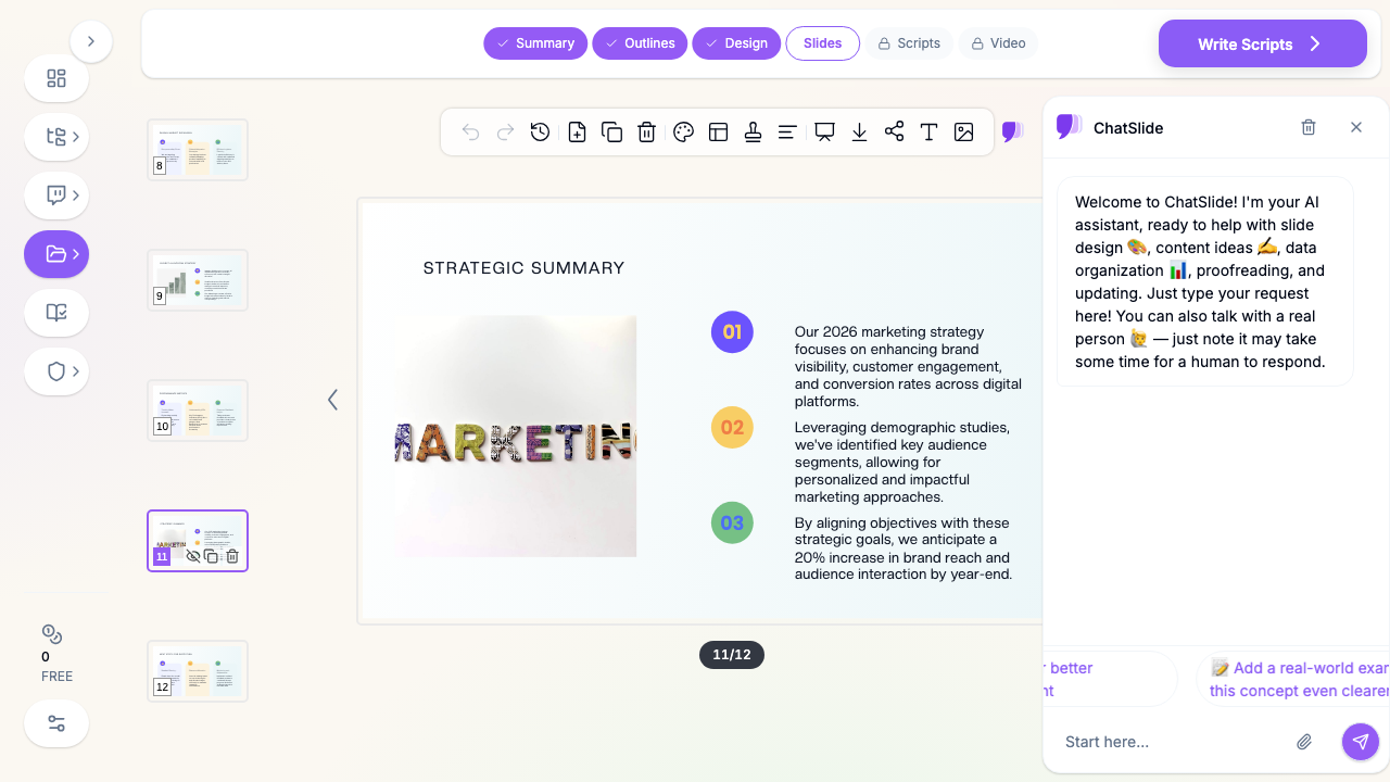
ChatSlide AI is built for the workflow above. It starts from your sources — upload a PDF, paste notes, drop in a spreadsheet — so the content is specific from the first draft. It generates real, editable charts from your data instead of decorative boxes, lets you control images, and gives you granular AI edit tools to rewrite any title or block. You can apply your brand fonts and colors, cut and reorder freely, and export to PowerPoint (.pptx) to finish by hand. It is still AI — but with the inputs and controls that let you avoid the generic look instead of being stuck with it.
The honest takeaway: no tool makes "AI slides that don't look AI" automatically. The decks that escape the fingerprint are the ones where a human fed in real material and then edited. The right tool just makes that fast.
Summary
AI slides look AI-generated when they are shipped as-is from a vague prompt: three boxes, meaningless icons, stock images, hollow bullets, and the same layout every slide. The cure is specificity and editing. Feed the AI your real content and data, turn numbers into real charts, swap generic visuals for specific ones, rewrite the filler, vary your layouts, apply your brand, give every slide a point of view, cut the bloat, and never ship the first draft. Choose a tool like ChatSlide that builds from your sources with real charts and full editing control — then spend the saved time making the deck unmistakably yours.