Quick Answer: ChatSlide is the AI research poster maker used by researchers and students at 750+ universities. Paste your abstract or upload your paper and it builds a structured single-page poster — title banner, Introduction, Methods, Results, and Conclusions blocks, real-data figures, and a reference box — in about two minutes, sized for A0 or 36×48". Built-in OCR, real charts from your data, and PubMed/Google Scholar search for the citations that matter. Free to start; exports to PowerPoint and PDF for the print shop.
The Poster Is Due and You Have a Blank Canvas
Your abstract got accepted to the poster session. Congratulations — now you have to design the thing. And a research poster is a strange artifact: not a slide deck you click through, not a paper you read top to bottom. It's one enormous page that has to communicate your entire study to someone walking past in fifteen seconds, then reward the person who stops to read it for three minutes.
That dual job is why posters eat time. Researchers routinely spend 6–12 hours on one: deciding what to cut, choosing a column layout, resizing figures to stay legible from three feet, balancing text and whitespace, fitting a references box to a character budget, and exporting at dimensions the print shop won't bounce. Almost none of that is intellectual work — it's layout and fighting with text boxes. That's the part AI handles well. You bring the science; the tool handles the arrangement.
Generic AI slide tools (Gamma, Tome, Beautiful.ai) aren't built for this — they make click-through decks, not a single sized poster page from your paper, with your figures and a real reference box.
What Makes ChatSlide Powerful for Research Posters
Start From Your Abstract or Paper — Not a Blank Page
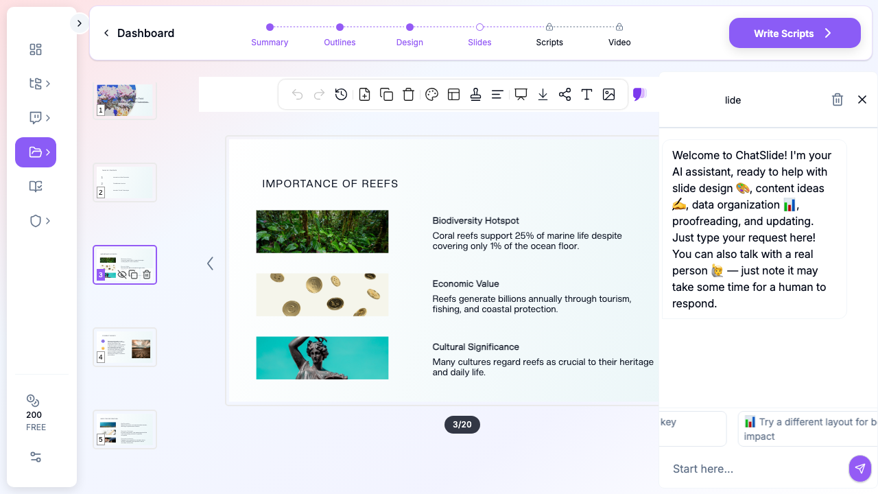
Paste your accepted abstract or upload the manuscript PDF, and ChatSlide reads your source and drafts the poster's titled blocks from your actual study — no retyping. Built-in OCR handles scanned PDFs and image-heavy files.
Canonical Poster Structure, Auto-Drafted
The AI organizes content into the sections a poster session expects — title banner with authors and affiliation, then Background/Introduction, Methods, Results, and Conclusions — so you start from a complete draft and edit down, which is far easier than building up from nothing.
Real-Data Figures Are the Hero
Results panels are the heart of a poster. Upload your charts, plots, micrographs, or raw numbers and ChatSlide renders publication-quality figures from your actual data with Chart.js and D3 — your data as the largest visual element, not decorative stock art. For context imagery where you have no figure, it can pull relevant visuals so no panel looks empty.
Print-Ready Export
Export to PDF (safest for printing — locks fonts and layout) or editable PowerPoint (.pptx) if your lab requires it. Standard sizes A0 (841 × 1189 mm) or 36 × 48"; a one-page letter-sized handout exports from the same file.
PubMed & Google Scholar for the Reference Box
A poster needs the load-bearing citations, not all of them. ChatSlide's Research tab connects to PubMed, Google Scholar, and Clinical Trials (NCT) — search by keyword, DOI, or trial number and pull the key findings, with citations, straight into your draft.
How ChatSlide Builds Your Poster
Step 1: Bring Your Source
Paste your abstract or upload your paper/results, and describe it: "Turn this into a single-page academic conference poster with Introduction, Methods, Results, and Conclusions and a references box."
Step 2: Let the AI Draft the Blocks
ChatSlide pulls your key points into titled sections. Review and trim — posters reward brevity, and the first draft always has more words than the page needs.
Step 3: Bring In Your Figures
Place your own charts and images in the Results column as the largest visual element; keep captions short with a one-line takeaway beneath each.
Step 4: Tighten Layout & Export
Pick a clean two- or three-column layout, confirm the eye flows top-to-bottom, keep the title biggest and the reference box smallest, then export to PDF/PPTX at your conference's required dimensions.
Use Cases
1. Conference Poster Session
Challenge: Compress a year of work onto one page that stops foot traffic. How ChatSlide helps: Draft from your abstract, feature your real figures, export print-ready. Time saved: 6–12 hours to ~2 hours.
2. Student Research Symposium / Capstone Poster
Challenge: A first poster with no template and a print deadline. How ChatSlide helps: Canonical structure out of the box; you edit content, not layout.
3. Lab Meeting / Departmental Showcase
Challenge: A quick poster for an internal showcase from an in-progress project. How ChatSlide helps: Generate from current results; regenerate as the work evolves.
4. Clinical / Medical Poster
Challenge: A case series or trial summary for a medical conference. How ChatSlide helps: Pull citations from PubMed and build figures from your outcome data.
Research Poster AI Tools Compared (2026)
| Feature | ChatSlide | Gamma | Tome | Canva |
|---|---|---|---|---|
Abstract/paper → poster draft | Yes | No | No | Manual template |
Single-page poster at A0 / 36×48" | Yes | No | No | Yes |
Real-data figures (Chart.js/D3) | Yes | Basic | Basic | Manual |
OCR for scanned papers | Yes | No | No | No |
Citation search (PubMed/Scholar) | Yes | No | No | No |
Print-ready PDF export | Yes | Yes | ||
Editable PowerPoint export | Yes | Yes | Limited | Limited |
Free tier | Yes | Yes | Yes | Yes |
What Separates a Good Poster From a Wall of Text
The most common mistake is treating the page like a printed manuscript. A ribbon-winning poster does the opposite of a paper:
- Leads with the finding, not the background — after the title, the eye should hit your key result or a figure of it.
- Is mostly visual — roughly 40% figures, 30% whitespace, 30% text.
- Reads in columns — title banner across the top; Introduction → Methods → Results → Conclusions flowing down two or three columns.
- Is legible from three feet — title ~72–120 pt, headers 36–48 pt, body no smaller than 24 pt.
- Has a repeatable takeaway — the one sentence you want remembered, in plain language, impossible to miss.
Tips for a Poster That Earns a Crowd
- Write the title as a finding: "Probiotic Treatment Cut Recovery Time by 30%" beats "A Study of Probiotic Treatment Effects."
- One takeaway sentence, large and unmissable.
- Kill the paragraphs — bulleted phrases win on a poster.
- Make figures self-explanatory from their captions alone.
- Leave whitespace — crowding makes good work look amateurish.
- Print a scaled proof and read it from three feet back before the full print.
- Bring a one-page handout so interested readers can take your work with them.
Posters, Talks, and Defenses Are Different Genres
If you present research regularly, keep the formats straight — same study, different arrangements you can spin from one ChatSlide source:
- A research conference talk walks an audience through one study in ~15 minutes of slides.
- A PhD thesis defense defends a completed body of work to your committee.
- A capstone project presentation presents a final undergraduate or graduate project.
- A research poster — this guide — compresses one study onto a single page for a poster session.
Frequently Asked Questions
Can AI turn my abstract into a poster?
Yes. Paste your abstract or upload your paper and ChatSlide drafts a single-page poster with titled sections, figures, and a reference box from your actual content in about two minutes.
What size posters can it export?
A0 (841 × 1189 mm) and 36 × 48" are standard; confirm your conference's required dimensions and export to PDF (best for printing) or PPTX.
Will it use my own figures?
Yes — upload your charts, plots, or images and place them in the Results column, or have ChatSlide build new charts from your raw data with Chart.js/D3.
Can it handle a scanned paper?
Yes, built-in OCR extracts text from scanned or image-heavy PDFs.
How do I get clean citations?
Search PubMed, Google Scholar, or ClinicalTrials.gov in the Research tab and pull the key sources — with citations — into your reference box.
Is it free?
There's a free tier to start, no credit card required.
Get Started
Your science is the hard part, and you've already done it. The poster is just arrangement — exactly what AI is good at. Paste your abstract or upload your paper into ChatSlide.ai, describe the poster you need, and you'll have a structured, figure-ready draft in minutes instead of an evening lost to text boxes. Free to start; export to PowerPoint or PDF when you're ready for the print shop.